
In the previous The Ultimate Introduction to Infographic Storytelling article, we learned a bit about the theory of informational storytelling. The best way to learn is by practicing, so let’s dive into infographic storytelling together! We will follow these steps one by one.
PRO TIP: Don’t concentrate on the design at the beginning – start with a sketch!
1. Choose a Captivating Topic
To create successful infographic storytelling, choose a topic that connects with your readers. Identify subjects that pique their interest or address common pain points. This guarantees that your infographic storytelling will grab their attention and offer value to your audience. Consider your target audience and the message you want to convey when making this decision.
2. Set Clear Goals
Having clear objectives is crucial to guiding your infographic storytelling. These goals shape your direction and help you choose the most effective chart types for your message.
Remember, we live in the so-called attention economy. What does that mean in practice? Attention spans are shrinking – so it’s essential to use visuals that spark real emotion and capture interest instantly. Think of your story as an attention funnel: it starts with why, moves to how, and ends with what. This structure boosts your chances of keeping your audience engaged all the way through.
3. Extract Relevant Data Insights
Gather data thoughtfully to strengthen your chosen topic and objectives, making sure that you use reliable sources that give accurate information. Find unique insights that can improve the story aspect of your infographic storytelling.
4. Organize and Visualize Your Data
Data organization is key to creating coherent and impactful infographic storytelling. Structure your information logically, keeping in mind the flow of your narrative. Choose visually appealing charts, graphs, and icons to represent data points.
5. Craft a Compelling Narrative and Design
Create a story that leads your audience smoothly through the information. Use clear and interesting language to effectively communicate the message of your story and make sure you design your infographic to look attractive.
Use a visually appealing layout, color scheme, and font, plus you can include design elements that improve your story and stir up emotions. Make sure your visuals not only help improve overall understanding but also have a unified design.
To bring these steps to life, I’ve created an infographic that visually showcases the process of infographic storytelling. It’s designed specifically for this article, following the storytelling approach we’ve covered. Take a look at the infographic below:
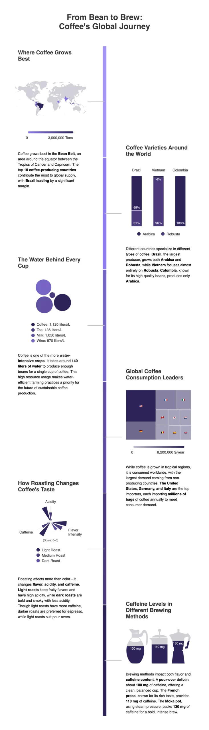
A robust infographic that explores the complexity of coffee – from where it’s grown to how it is brewed and consumed globally.
Now that the infographic is ready, let’s explore some additional tips for its creation!
Unlocking The Secrets To Enhance Your Infographic Storytelling
Using data-driven infographics can offer several benefits, enhancing the communication and understanding of complex information.
PRO TIP: Keep It Simple – avoid too much text or complex visuals.

5 Charts To Boost Your Infographic Storytelling
You can use various charts in an infographic to tell your story. Simple charts like line, column, and pie charts are good for basic information, while advanced charts can make the infographic storytelling have more impact. Using both basic and complex charts will improve how you tell stories with infographics and make them more interesting.
Let’s explore the most fascinating charts that boost your data-driven infographic storytelling!
1. Donut Chart
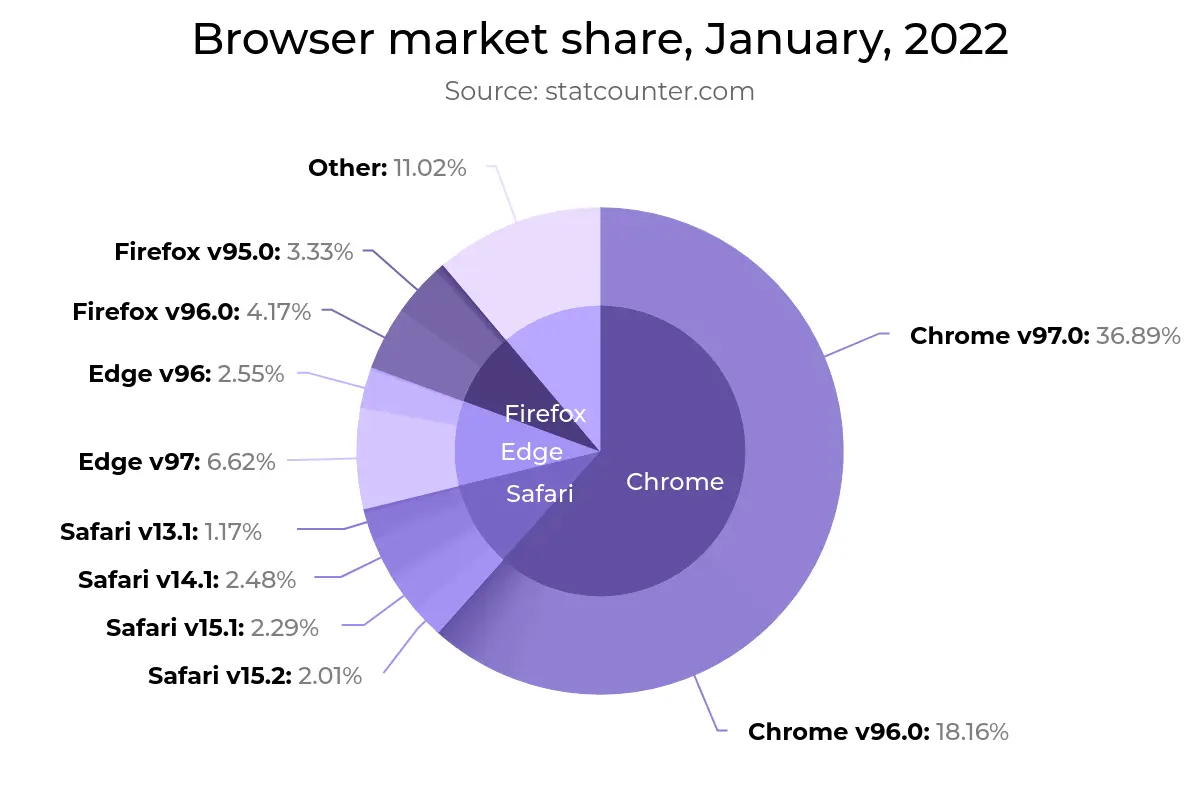
A donut chart illustrating the market share of different web browsers in January 2022.
The donut chart is a modern alternative to traditional pie charts. It provides a cleaner look and can enhance visual aesthetics. If you have one set of data and want to show the connection between categories, a donut chart can be more eye-catching than a regular pie chart.
2. Packed Bubble Chart
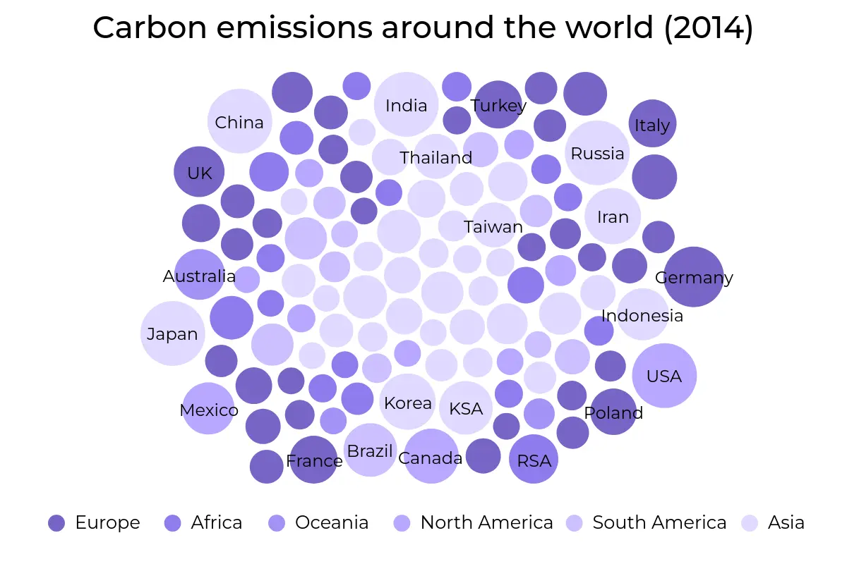
A packed bubble chart visualizing global carbon emissions by country in 2014, with bubble size proportional to emissions.
Packed bubble charts show relationships, proportions, and hierarchies in a dataset. It uses the size and color of bubbles to show extra information. They add another dimension to the visualization and make it more interesting.
The packed bubble chart cannot show data in a specific order, such as chronological but in that case you can use a simpler Bubble series. Be careful when using the packed bubble chart if some labels are not visible due to the complex visualization. In such cases, it might not be suitable for all types of data representation. Take a look at how one of our recent clients used a packed bubble chart to visualize complex data regarding multilingualism.
You can also use the map bubble chart series to represent data points in specific locations. This is useful for visualizing spatial patterns or regional differences.
3. Pictorial Chart
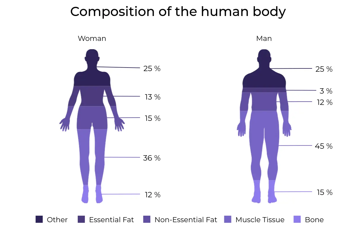
A pictorial chart illustrating the typical body composition differences between female and male silhouettes.
The pictorial chart is a versatile variation of the column chart. It transforms data points into visual elements using customizable images or shapes. Let’s compare it to the traditional column series:
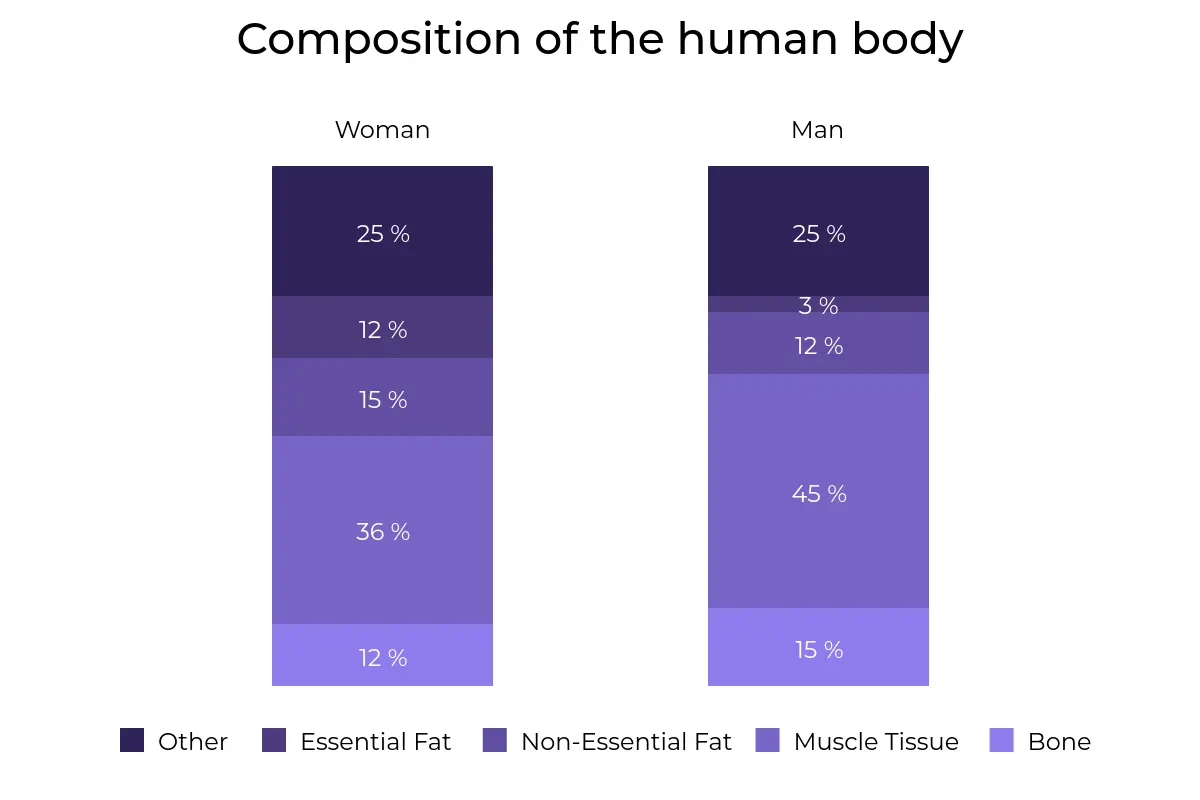
A comparative bar chart illustrating the typical body composition differences between women and men.
As you can see, an image representing the information makes the data more appealing and more memorable. This also highlights the creator’s creativity!
4. Tile Map
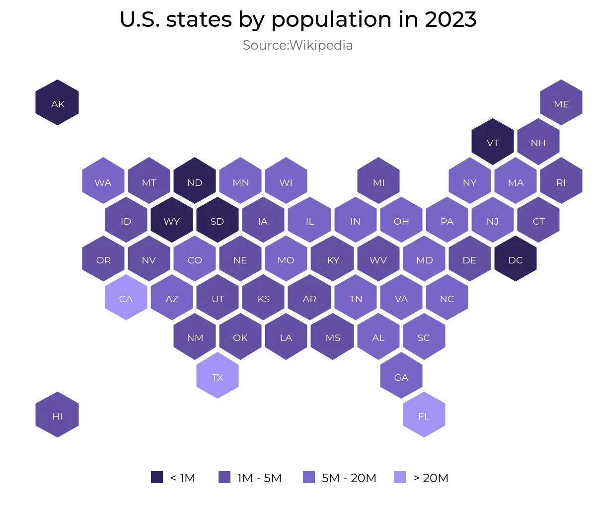
U.S. states by population in 2023 with hexagons colored according to population ranges. Source: Wikipedia.
The tile map is a simple way to show geographical data, breaking down regions into tiles or honeycomb shapes. It makes complex data sets simpler and helps show spatial information in an easy way. This is useful for making map visualizations simpler and easier to understand.
5. Map Chart
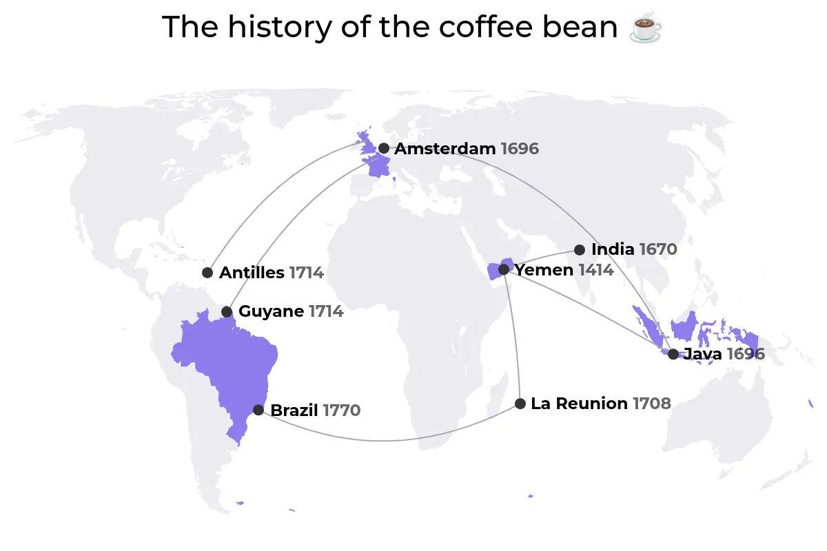
A world map illustrating the journey of the noble coffee bean from its origins to various parts of the globe.
You can customize map charts to show geographical data in different ways. There are several map series variations you can use.
Flow maps display how things move between locations, helping us visualize movement and trends. GeoHeatMaps are excellent for showing a lot of geographic data. They use color gradients to highlight concentrations or variations in different areas. Tile and Bubble charts bring unique visual elements into play, representing data points in an engaging and informative way.
Using map charts is a powerful way to display complex geographical information and it is definitely worth including them in your infographic storytelling!
Tips For Effective Storytelling
Use elements in your data story that help people understand and keep them interested. Here are some key data visualization elements for effective storytelling:
Visual Appeal
- Color Palette: Choose an effective color palette for aesthetics and conveying information. Colors have psychological associations that can evoke specific emotions. Warm colors, such as red and orange, may show energy and passion. Cool colors, like blue and green, may bring a sense of calmness and tranquility. Picking the right colors can highlight important things such as calls-to-action, key info, or important data.
- Graphics and Icons: Graphics and icons enhance the visual impact. Icons help associate text and aid in quickly understanding complex information. Add detailed illustrations to enhance the storytelling of your infographic storytelling. To illustrate the data, use the relevant chart type and keep the same style for all graphics as this will make them look more cohesive.
- Fonts: Pick clear and readable fonts that match the design and using consistent fonts keeps everything looking good and makes reading easy. Choose sans-serif fonts instead of serif ones as they are cleaner and simpler because they do not have the decorative strokes called serifs. This simplicity makes them easier to read, especially on digital media and in smaller fonts.
Compelling Content
- Time Frames: Use time frames to show when things happen in your data, whether about the past, the future, or the present. Presenting information in order helps users see how the data changes over time.
- Statistics: Infographic storytelling relies on data so use statistics to support your narrative. Use charts, graphs, or percentages to make the data easier for your audience to understand.
Knowledge Integration
- Facts: Add factual information to your infographic storytelling and ensure the facts are accurate, up-to-date, and relevant to the topic. Factual content makes your infographic storytelling more credible.
- Deductions: Go beyond presenting raw data by offering insights and deductions as this will help your audience understand the significance of the data and its implications. This changes your infographic storytelling from just information into a helpful tool for understanding.
PRO TIP: To create a strong infographic storytelling, ensure that visuals, content and knowledge blend well.
The Takeaway
In my view, data-driven infographic storytelling stands out as an incredibly effective medium. It blends visuals and narratives to convey complex details in a clear manner. Based on my observations, infographics play a crucial role in enhancing our comprehension and guiding our decision-making processes. They streamline intricate data, encourage teamwork, and pave the way for collective insights.
Recommendations
To discover more information about creating infographic storytelling and enhancing creativity, let’s explore the following recommendations for websites and blogs about data visualization:
Websites:
- https://informationisbeautiful.net/
- https://flowingdata.com/
- https://www.dataplusscience.com/
- https://www.economist.com/graphic-detail
Books:
- Infographic Design: Visual Storytelling with Information and Data, Nigel Holmes.
- Effective Data Storytelling: How to Drive Change with Data, Narrative and Visuals, Brent Dykes.
- The Art of Storytelling: Easy Steps to Presenting an Unforgettable Story, John D. Walsh.
- Cool Infographics: Effective Communication with Data Visualization and Design, Randy Crum
- The History of Information Graphics, Sandra Rendgen.
We help make better data-driven decisions. Contact us to set up a free consultation.