

Welcome to the fourth installment of our historical data visualization series! Imagine a gritty 19th-century London street, where a doctor plots dots on a map to hunt a cholera outbreak’s source. Picture a nurse sketching a rose-shaped chart to prove sanitation could save soldiers’ lives. These aren’t just tales of the Industrial Revolution – they’re the birth of modern data visualization.
This era of steam, steel, and sweat didn’t just transform factories; it sparked a visual revolution that still shapes how we see the world. Ready to see history through a new lens? Let’s go!
How the Industrial Revolution Transformed the UK
The Industrial Revolution transformed the UK, turning quiet villages into thriving cities. This map of towns in 1680 and 1830 shows the shift vividly. In 1680, small towns such as Bristol and Norwich had populations of fewer than 20,000 people. By 1830, Bristol’s population had tripled, surpassing 65,000.
Steam engines, coal mines, and textile mills drove this urban boom, pulling people from farms to factories, linked by railways. Yet, progress came with overcrowding, disease, and child labor. This dataviz reveals the UK’s leap from rural calm to industrial might, reshaping society.
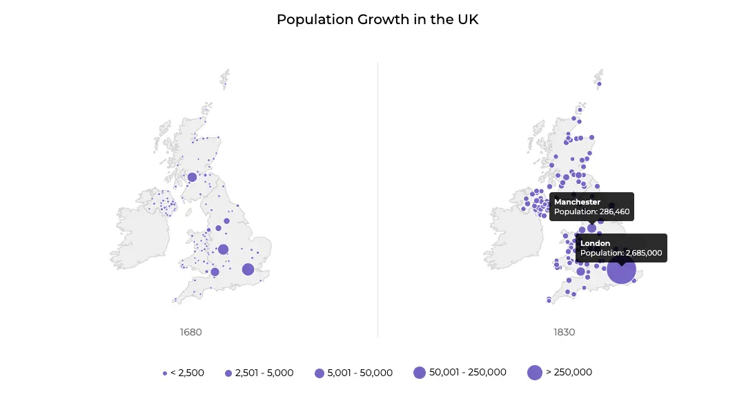
This split map shows the dramatic population growth of UK towns and cities from 1680 to 1830 reflecting the Industrial Revolution’s urban surge – source.
The Dawn of Dataviz in an Industrial World
Before the Industrial Revolution, data visualization existed – think cave markings, basic medieval maps, or Da Vinci’s first works – but it was less common. Then, as the late 18th century rolled into the 19th, factories rose, cities grew and trade surged. People needed to understand population spikes, economic changes, and diseases tearing through the increasingly crowded cities.
That’s when data visualization pioneers stepped in, turning confusion into clear maps and charts. One of the revolutionaries you may have already read about in a previous Data Vistory article (Bonaparte & Minard: French Revolutionary Works of Chart) was Charles Joseph Minard.
Another early dataviz visionary was William Playfair – a Scottish engineer who got tired of dull tables and invented the line graph in 1786. And yet another was John Snow (who actually knew something it turns out) – a doctor who mapped the cholera outbreak and saved countless lives.
What they invented weren’t just tools. They were breakthroughs born from necessity. The Industrial Revolution didn’t just build machines – it also reinvented the way we visualize data. And wait until you see how these charts tell stories.
State of the Chart – Iconic Maps & Charts from the Industrial Revolution
Let’s dive right into some of the visual gems that defined the Industrial Revolution. These aren’t dusty relics by any means; they’re the not-so-distant ancestors of every dashboard and infographic you love today.
John Snow’s Cholera Map (1854)
Picture this: London, 1854. Cholera’s killing hundreds and no one knows why. Dr. John Snow grabs a map, walks the streets, and marks every death with a dot. The result? A cluster around the Broad Street pump – a literal smoking gun proving contaminated water was the culprit. Snow’s map didn’t just stop an outbreak. It birthed modern epidemiology. It’s CSI meets dataviz and it’s gorgeous in its simplicity.
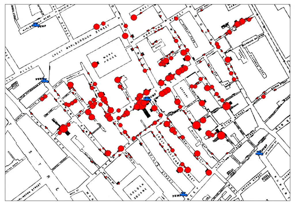
The map that stopped a killer. Today? Think COVID heatmaps. Same idea, fancier tech.
Florence Nightingale’s Rose Diagram (1858)
Florence Nightingale wasn’t just the “Lady with the Lamp”– she was a dataviz champ. After nursing soldiers in the Crimean War, she drew a stunning rose diagram to show that most deaths came from filth, not battle. Each wedge blooms outward, a visual plea for sanitation reform that convinced the British government to act. It’s beautiful, persuasive, and deadly serious.
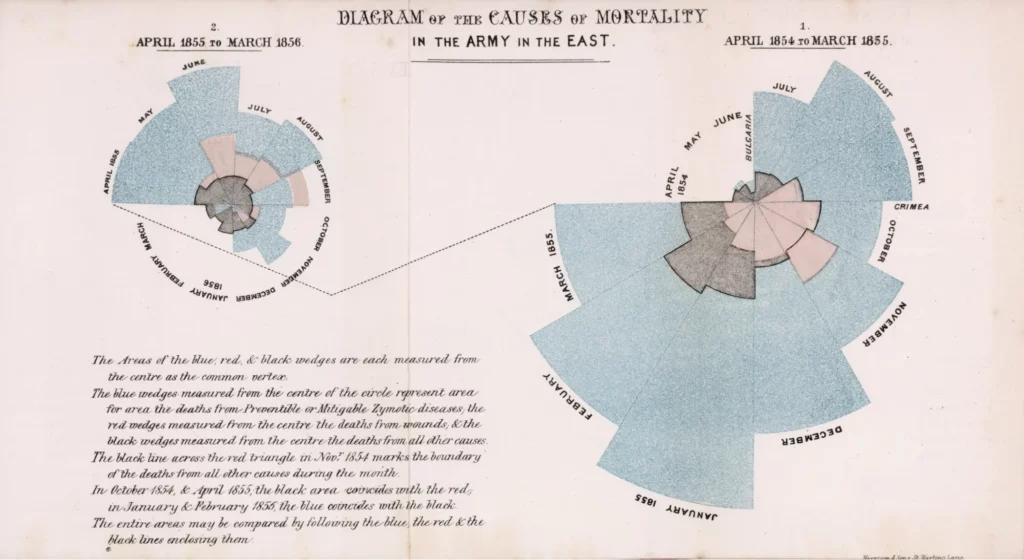
Today, Florence Nightingale’s Rose Diagram is the root of every polar area chart you’ve ever studied.
William Playfair’s Trade Balance Chart (1786)
Meet the OG of economic storytelling: William Playfair. In 1786, he published A Commercial and Political Atlas, debuting the line graph to track Britain’s imports and exports. Picture two wiggly lines racing across a page – one for money in, one for money out. It’s the first time anyone turned numbers into a story you could see. Playfair basically invented charts because he was bored of tables – genius!
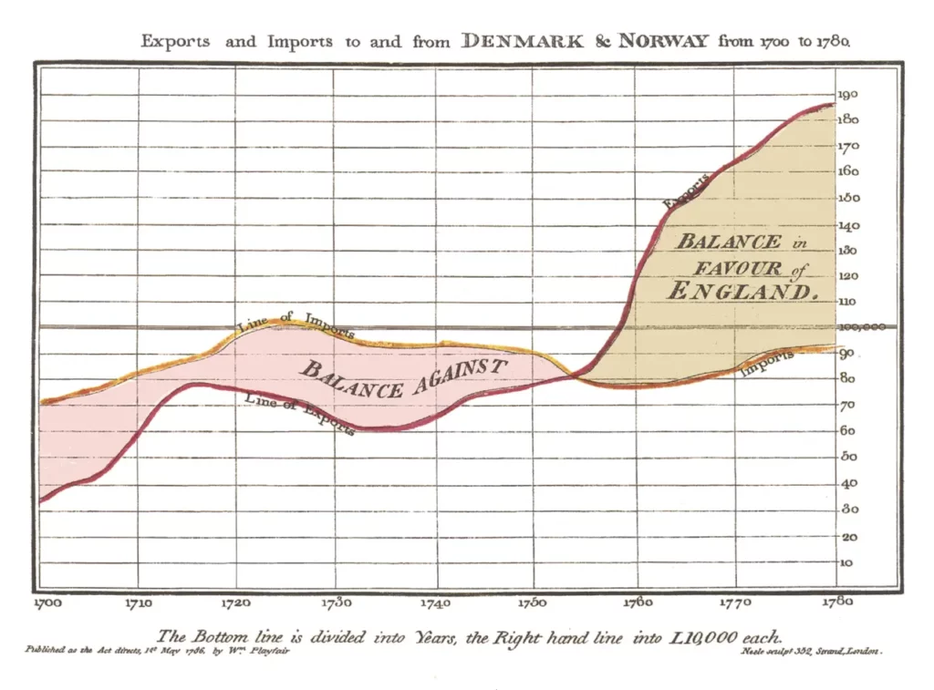
Today, it’s the granddaddy of every stock market graph you’ve ever squinted at.
Bonus: Modern GDP Growth Chart
Fast-forward to now: historians love plotting the Industrial Revolution’s economic boom. Take the GDP per capita chart from:
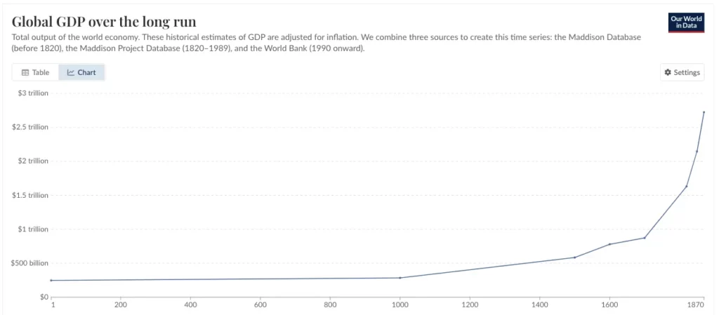
These charts aren’t just pretty – they’re proof of human ingenuity under pressure. Snow solved a mystery, Nightingale saved lives, Playfair decoded trade and today’s modern line chart shows the bigger picture. How’s that for a visual legacy?
Why These Charts Matter Today
The Industrial Revolution may feel like a distant era of smokestacks and top hats, but its dataviz lessons are more relevant than ever today. Back then, challenges like sprawling cities, global trade, and public health crises demanded new visual tools—much like today’s pandemics, markets, and climate data. Snow’s cholera map paved the way for GIS tools tracking wildfires and deliveries, Nightingale’s rose-inspired policy-changing infographics, and Playfair’s lines birthed modern BI analytics tools like Tableau. This era laid the dataviz foundation we rely on – next time you see a bar chart, thank the 19th century.
Beyond tech, these charts wielded power to transform lives: Snow halted a plague, and Nightingale drove reform. That’s the magic of dataviz—turning numbers into stories that resonate, even in our AI-driven world.
The Bottom line
From cholera maps to GDP curves, the Industrial Revolution didn’t just reshape the world – it gave us the tools to see it. These charts are more than history. They’re the spark of every visualization we love today. They turned raw data into action, beauty, and truth. Pretty cool, right?
I hope you enjoyed this piece. If you like reading about historical dataviz you should also definitely check out the Tulip Mania – The Dataviz Behind the Dutch Flower Bubble article. Thanks!