Bubble Chart: How to Use It to Get Better Insights
Bubble Charts show multiple data dimensions at once using the bubbles’ positions, sizes, and colors to highlight patterns and show hierarchies in a unique way.


A bubble chart is not just another data visualization tool. It lets you tell a story using three or even more dimensions of data at once. Imagine light, colorful soap bubbles floating gently – delicate but meaningful. Similarly, bubbles on a chart visualize complex relationships in a simple, accessible way. And that’s not all – with various ways to mark data, a bubble chart can become even richer and more informative.
What Is a Bubble Chart?
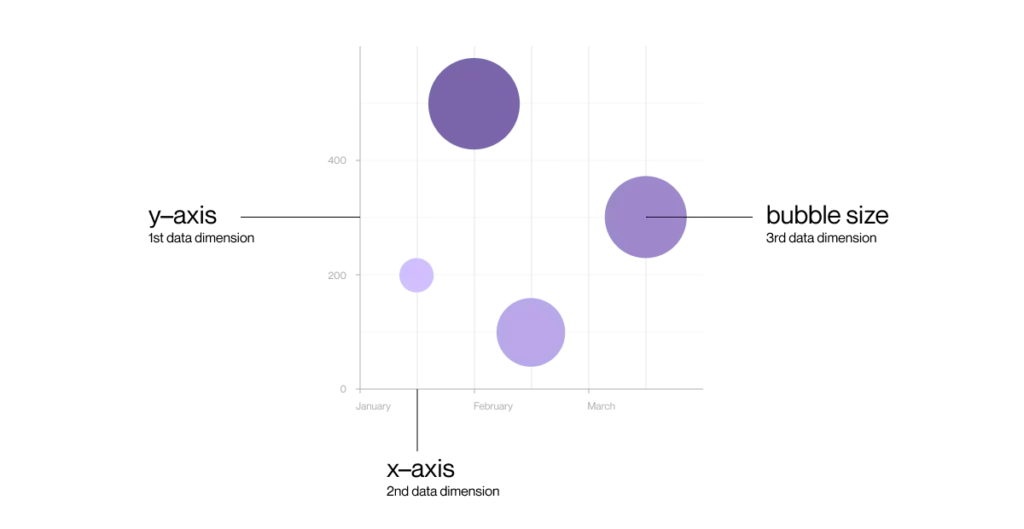
A bubble chart visualizes three variables simultaneously. The bubble’s position on the horizontal (X) and vertical (Y) axes corresponds to two data dimensions, while the bubble’s size represents a third dimension – usually a measure of magnitude or importance. Additionally, the bubble’s color can add yet another dimension, such as a group or category.
How to Read a Bubble Chart Without Getting Lost?
At first glance, this type of chart might seem complex, but it’s really simple once you know the basics. The X and Y axes show two features or variables, like company sales and profit. The bubble size might represent market share or sales volume. Its color can indicate another parameter, such as geographic region, customer segment, or product category. A well-designed bubble chart quickly reveals key relationships and differences between data points.
How Much Data Can Fit on One Bubble Chart?
Typically, a bubble chart shows three dimensions – X position, Y position, and bubble size. But you can include so much more! Common ways to add dimensions are: bubble color as a fourth dimension (e.g., categories or groups), bubble transparency as a fifth (e.g., intensity or confidence level), bubble shape (circle, square, triangle) for another dimension, animation or movement to show changes over time, and labels or text to provide extra context. This way, the chart can convey four, five, or even more data dimensions in a single visualization.
The most important thing about a chart is that it’s easy to read. Every extra layer adds more information for the viewer to process, so it’s best not to overcomplicate it. The simpler and clearer the chart, the easier it is to understand.
Real-life Examples Showing How Bubble Charts Tell Data Stories
Bubble charts are great for exploring complex relationships between variables. Here’s where they shine:
- Business and Market Analysis – to show how sales, profit, and market share define a company’s competitive position.
- Public Health and Medicine – to illustrate how factors like age, risk level, and access to care influence disease spread or outcomes.
- Marketing – to compare campaign effectiveness across platforms by looking at cost, reach, and conversion rates.
- Finance – to visualize investment portfolios by showing risk, return, and capital allocation.
- Ecology and Environmental Science – to map pollution levels or species diversity across different regions.
- Education – to analyze the relationship between student performance, attendance, and socioeconomic background.
Bubble charts make it easier to spot patterns that would otherwise stay hidden in raw numbers or simpler charts.
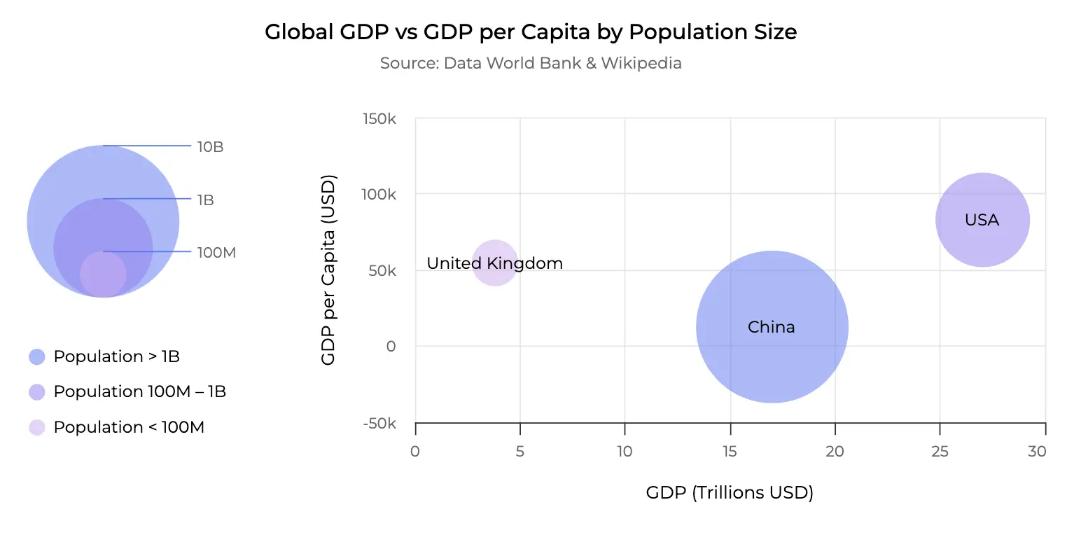
Visualizing Economic Giants: This bubble chart cleverly maps out the complex relationship between national GDP, population size, and GDP per capita.
Best Practices: What Makes a Great Bubble Chart Stand Out
A well-designed bubble chart doesn’t just display data – it guides the eye and tells a clear story.
To achieve that, a few key principles matter. First, limit the number of bubbles: too many, and the message gets lost in clutter. Use color and size intentionally to create visual hierarchy, helping the viewer focus on what’s important. Always scale the bubble area (not just diameter!) by value, so visual weight matches the data behind it. Choose a scale that makes comparisons intuitive – linear for narrow ranges, logarithmic for wide gaps. Label selectively to provide context without overcrowding. And don’t forget the legend: even the most elegant chart loses meaning without it. In short, a great bubble chart balances clarity with complexity – showing just enough, but never too much.
When Does a Bubble Chart Work Well – and When Not So Much?
Bubble Charts Work Best When You Want To:
- Visualize relationships between three or more variables at once.
- Spot patterns and outliers quickly in complex datasets.
- Present data in a visually engaging and interactive way.
- Show relative size or magnitude across categories.
Bubble Charts Might Not Be the Right Choice When:
- You’re working with too many data points – bubbles may overlap and clutter the view.
- The differences in bubble size are too subtle or too extreme, which can mislead interpretation.
- You’re trying to keep things very simple or focused on just one or two variables.
- You need precise comparisons – other chart types like bar or line charts may be clearer.
Other Visualization Options for Multidimensional Data
If a bubble chart doesn’t fit your needs, for example, due to too much data, there are other ways to visualize relationships in your dataset. Bar charts work well for straightforward comparisons between groups and categories, even though they show only two dimensions at a time. If you still need to convey a third variable, consider splitting the chart into grouped bars, using color coding, or creating small multiples (panel charts) to reflect different values across another dimension.
Scatter plots are useful when focusing on correlations between two numeric variables. If the third dimension matters, you can encode it using color, shape, or tooltip interactivity. Heatmaps help display intensities across two variables – for instance, time and location – and allow color gradients to represent a third variable such as volume or frequency. Line or area charts, on the other hand, are ideal for showing trends over time, especially if split by category or metric.
For even richer, multi-dimensional data stories, consider using interactive dashboards that let users explore multiple facets of the data dynamically. Choosing the right chart always depends on what you want to communicate – and how many variables need to be visualized clearly.
Summary: Bubble Chart in a Nutshell
A bubble chart is a powerful data visualization tool that shows more than two variables at once. It makes complex relationships easier to see and understand. Remember, however, that it’s not always the best choice – selecting the right chart is the key to effective data presentation. Try creating your own bubble chart and discover how easily you can bring your data to life!
If you want bubble charts or other visualization methods to become part of your product, feel free to book a free consultation here.